Your cart is empty now.

Judging Our Book by Its Cover
- 07 October, 2022
- Ray Hartjen
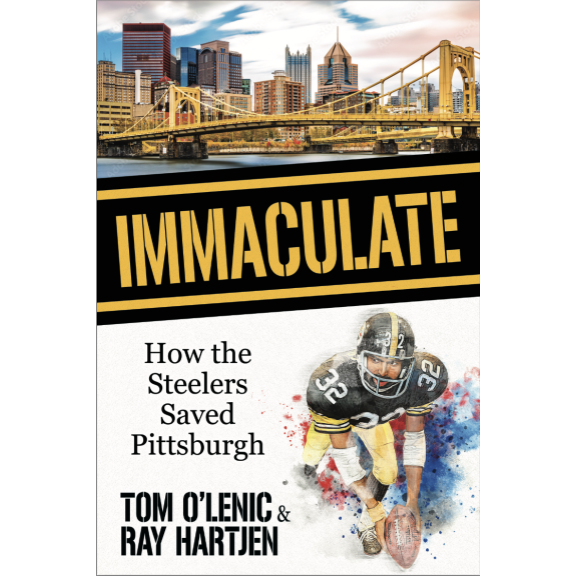
Designing the cover of Immaculate: How the Steelers Saved Pittsburgh was a process filled with anxiety. As writers of the book, Tom and I were in over our heads.
The words of the book we were good with. Writing the book was storytelling, and the typing came relatively easy. But, the cover, well that’s storytelling too, but one we knew nothing about.
Luckily, we had help. We worked with the design team of our publisher, Morgan James Publishing, and we settled on the final design. But, it took a while — and a lot of questions — to get there.
Before getting started, we were asked to share covers that we liked from other books. To this, I deferred to Tom, and he went shopping, so to speak. In browsing books, he selected several that I would describe as simple, elegantly clean with good use of negative or white space, and centered around a single image.

Additionally, we also spoke with the Operations team at Morgan James about potential cover design elements. That call was recorded for the benefit of the design team, and included musings of mine like possibly using diamond plate imagery to provide a visual “texture” for the book.
Yeah, it sounds all cool and artsy, right? But, seriously, I have no design chops.
Based on our comps and a general vision, the design team then went to work and pumped out six conceptual drafts for our review.
The first thing Tom and I noticed on several concepts was the placing of our names at the top, in big letters. That just gave us the heebie jeebies. Come on, it’s not like either of us are Stephen King. We felt much more comfortable with our names being subordinate on the cover.

We liked several different elements across the variety of initial concepts. For example, we would like a powerful font, one that evokes strength, from one design, but the picture of another. Or, rather, pictures. You can’t call a book “How the Steelers Saved Pittsburgh” without telling the stories of both Pittsburgh and the Steelers. As such, the title of the book lent itself to two images.
So, we mixed and matched design elements and asked the design team to come back with some revision. They did so, giving us five different options to consider.
Then, a funny thing happened.
You know how attachments get sort of jumbled up on emails, where the order of attachments, in terms of left to right, for instance, doesn’t necessarily reflect the attachment’s file name?
You can see where this is going, can’t you?
As Tom and I discussed the different covers over both email and text, Tom expressed he really liked “the third one.” I interpreted that as being the file named “Immaculate_FrontCvr_NEWopt3.” Thus, I sent word to the publisher about our final selection.
Then, later in the day, I noticed a text message from Tom that included words along the line of “I like the one with the skyline of Pittsburgh on it.”
Oh, no. Tom was referring to the draft that lined up in third position, left to right, as attachments on the email from Morgan James. It had the file name of “Immaculate_FrontCvr_NEWopt5.”
I had sent the wrong file back to Morgan James as final cover design!
Luckily, it was a case of “no harm, no foul.” Morgan James hadn’t initiated anything it needed to correct. Ultimately, in the end, we got the cover that Tom liked best.

But, just imagine for a moment that Tom didn’t mention his preference for the skyline in passing as part of a larger text message. Wow. He sure would have been surprised when he saw the book!
Search
Archive
- September 2024


